Tokens, building blocks, voice.
The open reference for Struqo's visual system, from tokens to whole pages. Every value comes live from the code, Figma follows it. Agents read the same building blocks in apps/web/components/styleguide/catalog.ts.
Molecules
A few atoms with one shared purpose, such as label, field and hint forming a form field.
Four conventions, graded by urgency. Error (red) for blocking errors or data inconsistency. Warning (yellow) for attention that does not block. Hint (blue) for neutral information. Success (green) for confirmations. Color carries the message; the container stays restrained.
Error
Warning
Hint
Success
Inline notice in four tones: warning, alert, hint, success.
The plain statement leads through position, not through brightness. Label and hint stay in the same quiet tone. The activity signals are loud, and so is the elapsed time, which turns yellow after 6 seconds and red after 12, in the colour language of the save dot in the header. Below it an indeterminate bar runs at working pace (1.6s, linear): a determinacy sign that claims no percentage nobody has. The indicator appears from the first millisecond and fades out over 180ms at the end, so it never invents waiting time. Only after 6 seconds do the elapsed counter and the sawing Struqo craftsman join in, where distraction helps rather than slows. Under prefers-reduced-motion the stripe holds still, the text remains.
Loading indicator: text leads, bar carries, figure only when it takes long.
Page title with slots for title, actions, breadcrumb and a meta line, with an optional divider. It sits inside the page and is not the app-shell chrome (that arrives as its own organism).
Projects
Projects
Projects
Header of app pages with breadcrumb, title, actions and meta.
Label, helper text, error message and the a11y wiring around any control. The error state sets aria-invalid and tints the border. Control-agnostic: input, select or textarea.
We never share it.
Required field.
Labelled input with helper and error text.
Tab bar of links for page sections that the server swaps via the address.
Click a tab, then use the arrow keys, Home and End.
Tabs that switch panels in the browser, with arrow keys, Home and End.
Confirmation before an action that cannot be undone. Names the object and starts on cancel.
Place, mode, switching and creation in one spot above the drawing.
One selection list for five instances: project, sheet, type, snap step, unit. The entry in force is marked and stays selectable; disabled is reserved for what does not exist. Click the button to open, Esc closes it and returns focus.
List for switching between drawings or projects.
List-item container in three variants: static for passive info, interactive with a hover state, and with an actions menu for secondary operations. The card body is always the primary click target. Secondary actions live in the ⋯ menu in the top-right, never as parallel buttons.
Secondary info, kept neutral
Secondary info, kept neutral
Secondary info, kept neutral
Surface for one object with title, actions and summary.
Menu at its trigger with items, including destructive ones.
The drawings rail shows per view whether the projection still matches its source plan. This is not a save status: it knows nothing about the network or the server, it only compares derivation against source. A closed ring means complete, an open arc means something is missing. One click brings it up to date.
Shows whether a derived drawing is up to date.
A sheet of the example as a way into the editor. With a head line it sits as on a board, the image 8 px below its baseline. Without it, it appears like this on the subpages.
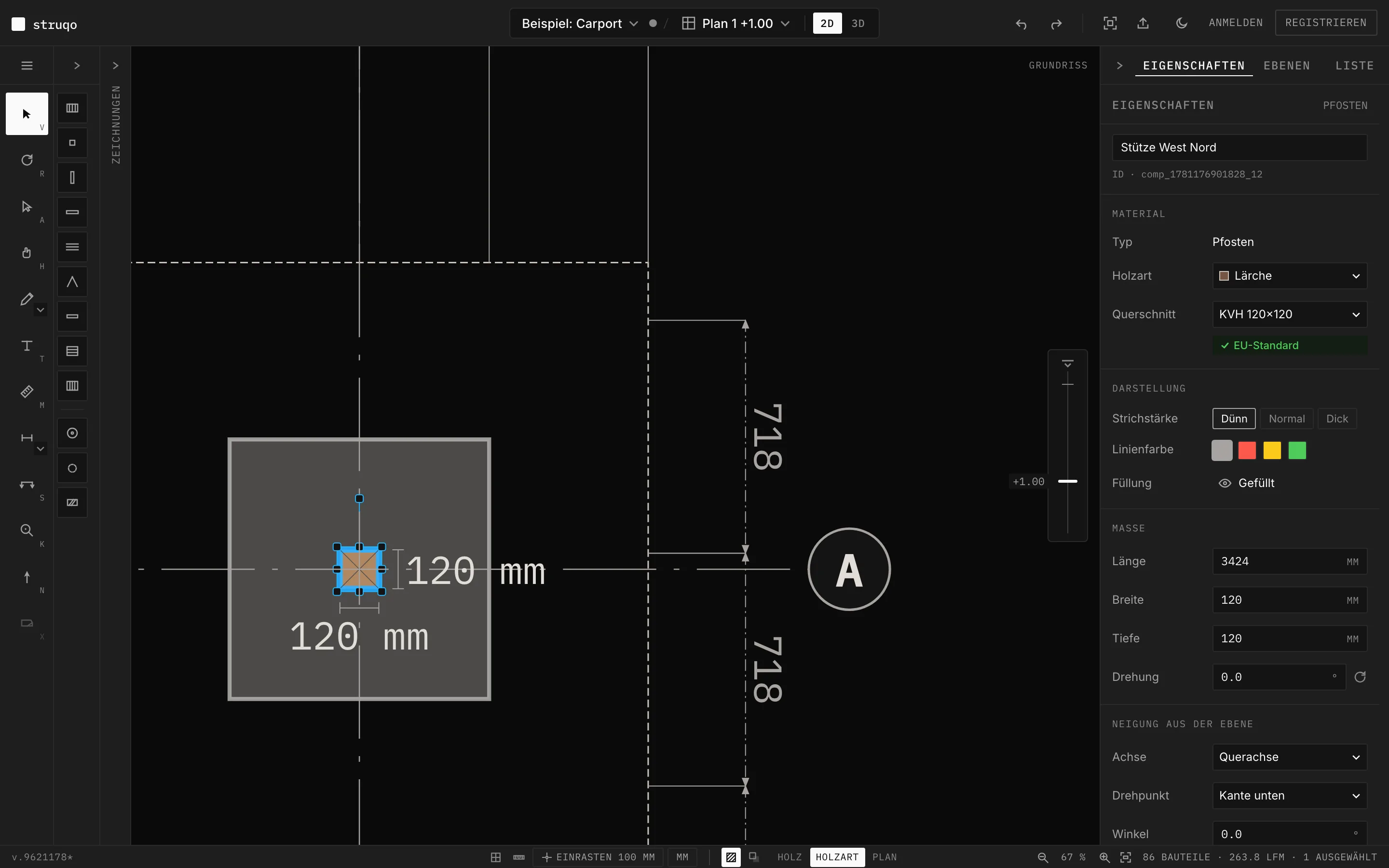
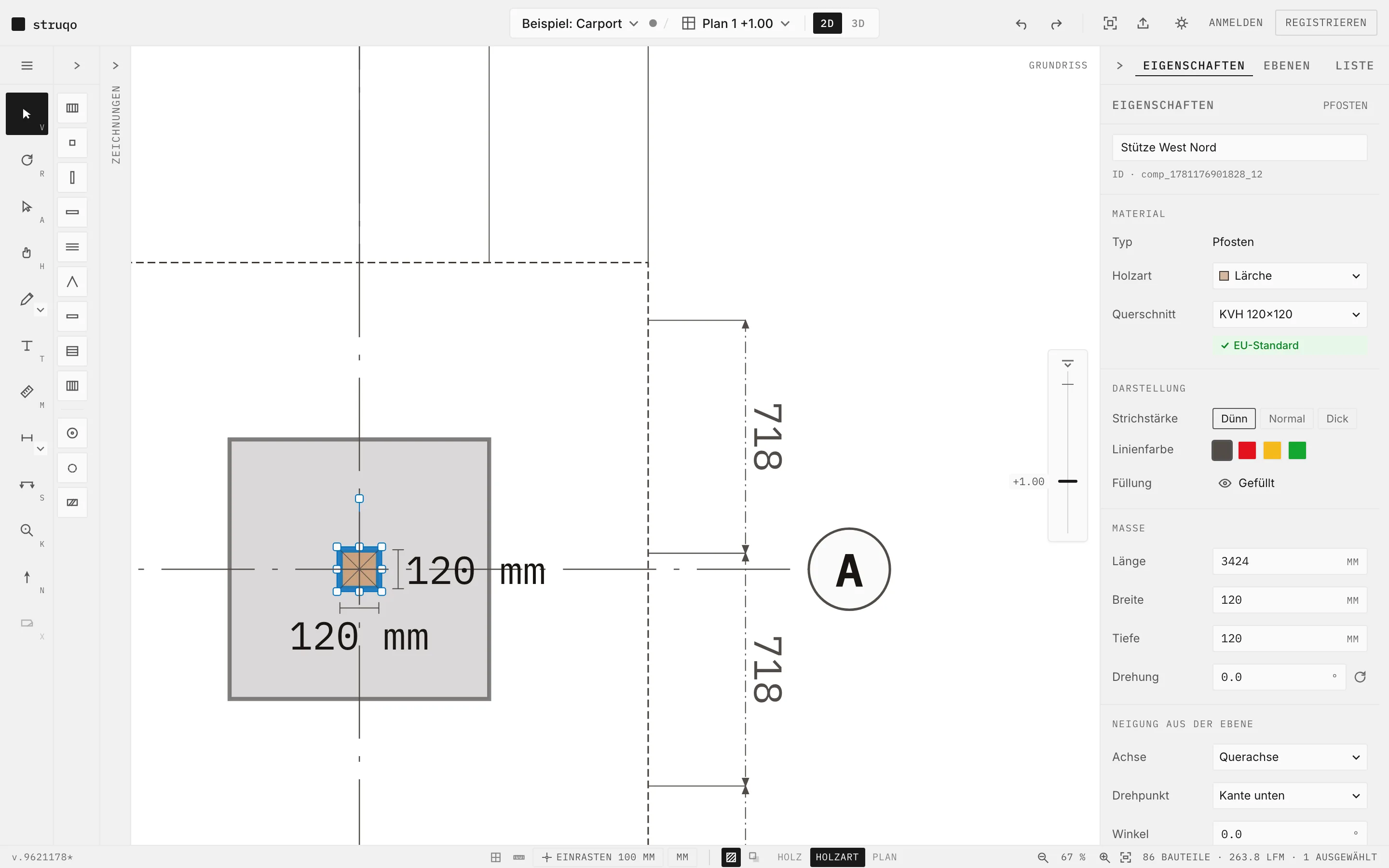
Dimming: what carries the message stays bright, the result on the drawing area and the marked control. Everything else is darkened when the image is taken, 50 % in the light and 60 % in the dark image.
Image of the editor on the marketing pages, frame with radius 8 and a strong line, caption in mono, backlit against the page. Optionally with a head line (figure and detail) as on the home page. A click opens the example in the editor.
Key facts in the tone of a plan. Each field takes two modules of the register, the lines move no baseline.
- Updated
- 2026-09-30
- Stage
- Beta
- Example
- 12 sheets
- Changes
- Journal
Title block for marketing pages: a few key facts as term and value in mono, four fields in a row, two by two on a phone.
Selectable tile in context menus.
No live demo on this page.
Product video on a marketing page, in the same frame as the editor image: poster with one start button, only the click loads the video and shows the browser controls with subtitles. Counts `video.started` once per page view.
No live demo on this page.
"More" disclosure under a section of a subpage: facts from the product state, collapsed.
No live demo on this page.
Page trail above the H1 of a subpage: home, “Features” for feature pages, then the page itself as text.
No live demo on this page.
Collapsible section in the properties panel.
No live demo on this page.
Sheet in the drawings rail with thumbnail and state.
No live demo on this page.
Floating feedback, the surface carries the status.
No live demo on this page.
Toggle bar such as 2D|3D.
No live demo on this page.